
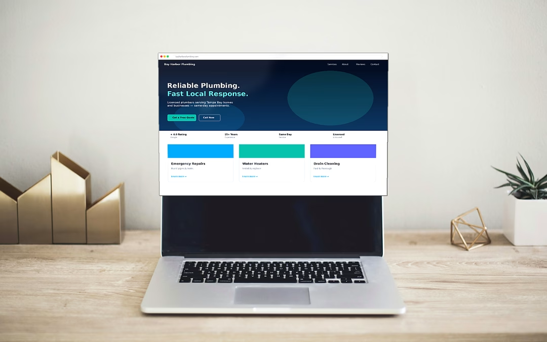
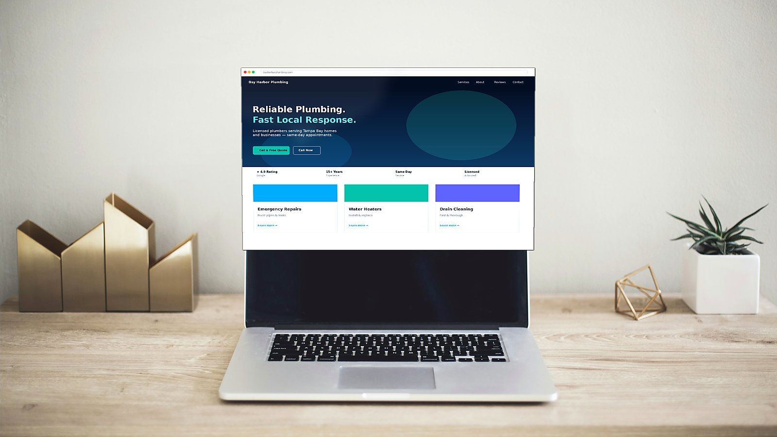
Your site looks fine. Your phone stays quiet.
You paid for a website. The colors match the brand. The photos look sharp. Friends say it looks professional. Then weeks go by—and a small business website no inquiries reality sets in: few calls, empty contact forms, and leads that still come from referrals or Facebook, not the site you invested in.
That gap is common for Tampa and other local service businesses—HVAC, plumbing, contractors, med spas, law firms, landscapers, and similar shops. The site is not “broken” in the obvious sense. A focused web design and website build can make that next step clearer. Pages load. The menu works. Nothing looks outdated on a laptop screen. Yet visitors leave without reaching out, and the inbox stays quiet.
Owners often assume the problem is traffic. Sometimes it is. Just as often, people do land on the site—from Google, a Google Business Profile, or a shared link—and never take the next step. The page did not fail a beauty contest. It failed a decision test.
Here is the hard part: looking fine and converting are different jobs. A site can pass a casual visual check and still fail the only test that pays the bills—someone deciding, in under a minute, that you are the clear, trustworthy next step.
This post walks through why “pretty enough” websites stall, what actually drives inquiries for local service companies, and a practical checklist you can use before you rewrite everything or blame the market.
Why “looks fine” fails: design vs. conversion
Design answers: Does this feel credible and on-brand? Conversion answers: Does a busy local customer know what you do, why you, and how to contact you—without hunting?
SEO and getting found in search matters.
Many small business sites stop at the first question. They get a custom hero image, nice typography, and a homepage that reads like a brochure. What they often skip:
Vague headlines and buried services
If the first screen says “Quality Solutions for Your Needs,” a visitor still does not know if you fix ACs, remodel kitchens, or file taxes. Clarity beats cleverness. Name the service and the area you serve early.
Weak or competing calls to action
A small “Contact” link in the footer is not a plan. When every button says “Learn More,” nothing asks for the inquiry. Strong sites put one primary action—call or request a quote—where thumbs and eyes already are, especially on mobile.
Trust treated as decoration
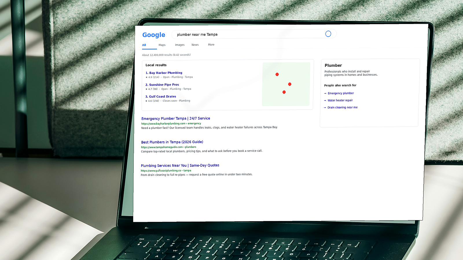
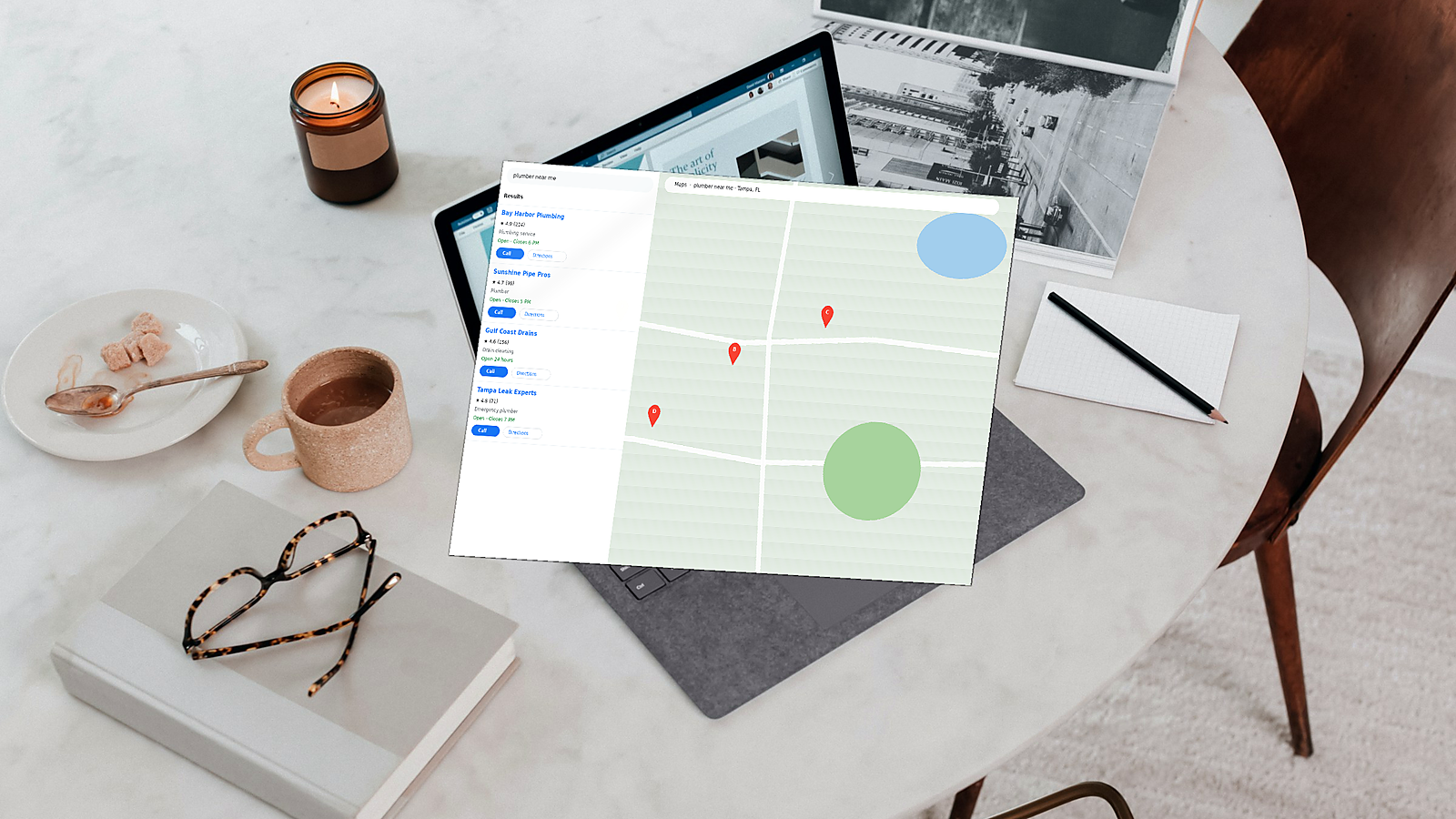
Stock photos, generic “we care about customers” copy, and no reviews, licenses, or real project proof leave people unsure. Local buyers compare you to competitors in the map pack and on their phones. They need reasons to choose you, not just a clean layout.
Mobile as an afterthought
Most local searches happen on a phone. If tap targets are tiny, the phone number is not clickable, or the form is a chore, you lose the inquiry before design praise matters.
A site can look fine in a desktop screenshot and still be hard to act on in the real world. That is design without conversion.
What actually drives inquiries
Inquiries come from friction going down and confidence going up—usually in the same visit. Focus on these levers.
Trust signals that feel local and real
Show reviews (with context), years in business, licenses or associations where relevant, service-area clarity, and photos of real work or your team. Tampa customers notice when a site feels generic versus rooted in the market you serve.
Clarity above the fold
In one screen, answer: what you do, who it is for, and where you work. Follow with a short line on what makes you different—response time, specialization, guarantee—not a paragraph of mission language.
Obvious, repeated CTAs
Use one primary action (Call now / Get a free estimate) and one secondary (Text us / Book online) if needed. Repeat the primary CTA after proof sections, not only in the header. Make the phone number click-to-call on mobile.
Fast, simple mobile paths
Keep forms short: name, phone or email, service needed, zip or city. Remove fields you do not use. Ensure buttons are easy to tap and the page does not jump while loading.
Proof near the ask
Place a review snippet, “serving Hillsborough County since…,” or a before/after near the contact form or quote button. People decide at the moment of action; proof should be there, not only on a buried About page.
None of this requires a full visual redesign. It requires structuring the page so a stranger can trust you and contact you without thinking hard.
A practical checklist (and a sensible next step)
Use this as a quick audit—not a redesign wishlist:
- Homepage headline — Does it name your service and city/area in plain language?
- Primary CTA — Is call or quote visible without scrolling on mobile?
- Click-to-call — Does the phone number work as a tap target?
- Form length — Can someone request help in under a minute?
- Proof — Are reviews, credentials, or real photos near the CTA?
- Service pages — Does each main service have a clear page with its own ask—not only a homepage blurb?
- Speed and clutter — Does anything slow the page or distract from contacting you?
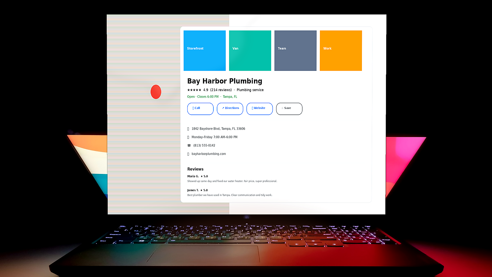
- Consistency — Do name, phone, and hours match your Google Business Profile?
If several items fail, that usually explains a small business website no inquiries problem better than “we need more traffic.” Traffic without a clear path to contact is expensive noise. If you are ready for the next step, request a quote and outline the biggest friction point.
When you want a second pair of eyes on structure, CTAs, and local trust—not just a prettier skin—ProDeveloper helps small and local service businesses turn websites into inquiry channels. Start with the checklist above; fix the highest-friction item first. Then decide whether a focused conversion pass beats another round of visual polish.