
Why Homepage Layout Decides Contact vs. Bounce
Your homepage has about five seconds to answer one question: Should I stick around? If the answer is fuzzy, people leave. If it is clear, they stay long enough to become a lead. That is why homepage layout matters more than fancy animations or a clever brand story. Layout is the path. Path decides contact.
Most Tampa small businesses invest in traffic—ads, SEO, referrals—then wonder why the phone stays quiet. The usual culprit is not the offer. It is the order of information. Visitors land, scan for relevance, and decide whether contacting you feels safe and easy. A weak homepage layout buries the offer, hides trust signals, and makes the next step feel like homework.
Think of your homepage as a conversation with a stranger who is busy. Lead with who you help and what happens when they reach out. Show proof early. Make the contact action obvious. When those pieces sit in the right places, the same traffic starts producing inquiries instead of exits.
If your current site feels “pretty but quiet,” the fix is rarely more content. It is a tighter homepage layout that guides eyes from headline to proof to action without friction. That is the same discipline we use in Tampa web design projects: clarity first, decoration second.
Above-the-Fold Essentials: Headline, Offer, CTA, Trust
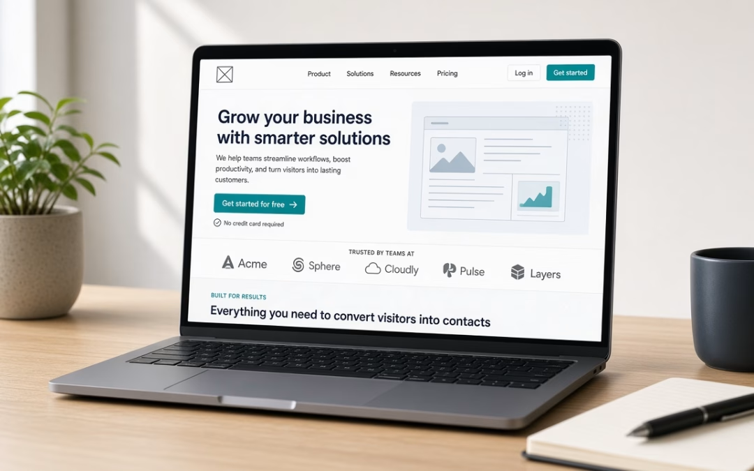
Above the fold is everything visible before someone scrolls. This zone does the heavy lifting. If it is vague, scroll rarely saves you. Build it like a sales desk, not a brochure cover.
Headline that names the outcome. Skip slogans that could fit any company in town. Speak to the visitor’s problem and the result you deliver. “We build websites” is weak. “Get a site that brings Tampa customers to your phone” is stronger. Your visitor should know in one glance whether they are in the right place.
Offer in plain language. Under the headline, state what you sell and for whom. Local service businesses win when they name the service and the area. Clarity beats cleverness. If someone has to decode what you do, they will not contact you.
One primary call to action. Buttons compete when you offer three equal choices. Pick one primary action—Request a Quote, Call Now, Book a Consult—and make it visually dominant. Secondary links can exist, but they should not fight the main CTA for attention.
Trust within the first screen. Logos of clients or partners, a short review snippet, years in business, or a simple “Licensed & Insured” line reduces risk. Strangers do not contact strangers. They contact businesses that look established and specific.
A strong above-the-fold homepage layout answers four questions fast: What is this? Is it for me? Can I trust it? What do I do next? Nail those four and bounce rates drop while contact intent rises.
Mid-Page Proof and a Services Path That Leads to Contact
Once the fold earns attention, mid-page has one job: prove you can deliver and show how to start. This is where many sites drift into wall-of-text territory. Keep the path tight.
Proof before deep service lists. Case outcomes, short testimonials, before/after results, or a simple “how we work” strip outperform long paragraphs. Busy owners scan for evidence. Put evidence where eyes land after the fold—then invite the click.
Services as a path, not a catalog dump. List what you offer, but each item should point toward contact, not dead-end curiosity. A short services grid works: name the service, one benefit sentence, and a link or button toward the quote form. Avoid burying contact behind nested pages with no return path.
Local relevance helps conversion. Tampa buyers notice when your examples feel local—neighborhoods, industries, and language that match their world. Pair that with search visibility so the right people arrive ready to act. If traffic quality is soft, pair layout improvements with a focused Tampa SEO company strategy so the visitors you convert are already looking for what you sell.
Reduce friction on the way to contact. Every extra form field, popup, or unclear button costs leads. Mid-page should reinforce the same CTA you featured above the fold. Consistency builds confidence. If the top says “Request a Quote,” the middle should not suddenly push “Download Our Ebook” as the main move unless that ebook is clearly the first step in your sales process.
When mid-page proof and services sit in a clean sequence, visitors do not have to hunt for the next step. They feel guided. Guided visitors contact more often.
Homepage Layout Checklist and Your Soft Next Step
Use this checklist to audit your current page in fifteen minutes. If you miss more than two items, layout—not traffic—is likely your bottleneck.
- Headline names the outcome for a specific customer type within one line.
- Offer is obvious without reading a paragraph of brand history first.
- Primary CTA appears above the fold and repeats mid-page without competing siblings.
- Trust signals appear early—reviews, logos, credentials, or concrete results.
- Proof sits before long copy—testimonials or outcomes near the top third.
- Services lead somewhere—each path ends in contact, not a dead end.
- Mobile matches intent—buttons are thumb-friendly; text is readable without pinch-zoom.
- Contact options are simple—short form, clear phone, or booking link with minimal fields.
- No sidebar clutter fighting the main column for attention on the homepage.
- You can explain the page flow in one sentenceheadline → proof → services → contact.
If those boxes are unchecked, rewriting more blog posts will not fix the leak. Fix the homepage layout first. Then measure inquiries for two to four weeks. Most small businesses see clearer contact volume once the path stops fighting the visitor.
Ready for a layout that earns replies instead of silent exits? Start with a quick review of your current homepage against the checklist above. When you want a second set of eyes—and a build that puts clarity ahead of clutter—request a quote now and we will map a practical next step for your Tampa site.
A homepage that contacts strangers is not louder. It is clearer. Put the right pieces in the right order, and the people who already found you will finally reach out.